Anyway I am going to continue to post tutorials that concentrate on making the technical aspects of shooting a whole lot less expensive.
Most of my studio still life shots are made with window light, either indirect or diffused. Shower curtains, tracing paper, anything without a color cast works.
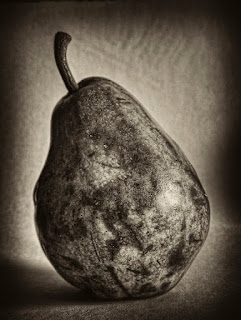
 Here's one. A black card (at an angle) provided the background.
 I put an almost rotten pear on a curved sheet of typing paper and shot hand held at ISO 400. Tweaked it in Photoshop - since I can't afford to buy all the chemicals to do historical processes, I let Photoshop do the dirty work.
AND: Why most books I've read on Photoshop are almost worse than useless.
Most computer books are way too expensive to start with. And when I pay $30 - $50 for a book that promises to unlock the secrets of a given program, I almost always feel cheated.
One is faced with a glut of information, and some pretty pictures, ande told to purchase all sorts of extra back up drives, monitors, and such. It's like wanting to learn cabinet making and being given instructions on how to use every tool in the shop in one sitting, leaving no room for what one wants and needs to know.
You don't need to know how to operate a lathe to build a shelf. Or a book case.
I'd prefer that these books kept it simple and concentrated on making images, and not selling us stuff.
To paraphrase old Ansel Adams - making a print (image) is akin to the performance of a piece of music - each time a performer plays the piece there will be slight variations, changes in expression, deeper maturity and understanding of the composition.
1. open image
2. duplicate background
3. save image as a PSD file!
4. stare at image
Repeat step 4 as often as needed.
5. decide what you are going to do with the image (print it, post on blog, email to your cousins, etc.)
6. stare at image some more
7. does it need anything? decide what you need to do.
When I first started printing for publication i was always asked for prints that had "snap" that "popped" and generally would catch the attention of the viewer and would withstand the degradation of the dot screen process as well.
Fast popping technique #1 - open the Levels adjustment layer and move the top right hand slider to the left a little.
#2 - add a thin black line around the image (edit/stroke/black/one or two pixels).
No comments:
Post a Comment